Week Nine
- Mar 8
- 3 min read
Updated: Mar 11
Blog posts arranged newest to oldest.
To-do:
Press kit!
Assist in any way I can with project wrap up!
Mentor Feedback:
Water shot feels a little flat, get the same value range as flower shot - Water shot and cloth shot seem flatter than the rest
Sound transition from water to cloth more smoother
Camera pop in last shot?
Background of shot 1 is too saturated? Needs white highlight on the stand
Stand in shot 1 needs a little bit more work, seem plastic- Should not get that gray
Shape of background shadows is fighting the composition in Shot 1 - Maybe brighter parts of the background lead our eye to the ring rather than the dark bits
Flower in Gracie’s blog is better
Music was not what I expected, doesn’t seem like the vibe of the brand? - Should be more elegant, its too jazzy, has to be more ambient
For motion design -
Position of words in flower shots
Can have more fun with the motion design ex. Heart beat replicates heartbeat
“Sleep” can feel more sleepy
Submitted Week Nine Video:
3/5/26
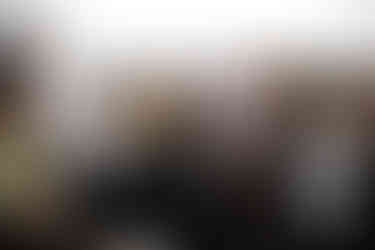
One of the main critiques from the feedback session was to take another look at the terrazo texture of the pedestal in shot one. The original texture image was AI generated but unfortunately, it was not working for the shot anymore.
I went into substance painted after reworking the UVs a bit in Maya and played around with a more interesting base, roughness, and displacement map. Substance has a terrazo smart material already set up, so I started with that and tweaked for a bit, adding some more variation in color, some dirt, and some scratched.


Before and after texture in shot:


3/3/26
Today, we were lucky enough to receive mentor feedback from mentors in person! Mentors from Harbor, ETC, and C.A.T. visited SCAD and attended class to give us continued feedback and help on our project.
Feedback:
Kyle
Water shot feels a little flat, get the same value range as flower shot
Sound transition from water to cloth more smoother
Molly
Camera pop in last shot?
Kyle
Water shot and cloth shot seem flatter than the rest
Molly
Background of shot 1 is too saturated? Needs white highlight on the stand
Kyle
Stand in shot 1 needs a little bit more work, seem plastic
Should not get that gray
Shape of background shadows is fighting the composition in Shot 1
Maybe brighter parts of the background lead our eye to the ring rather than the dark bits
Beck
Flower in Gracie’s blog is better
Kyle
Water shot is the one that needs the most work
Pheya
Music was not what I expected, doesn’t seem like the vibe of the brand?
Should be more elegant, its too jazzy, has to be more ambient
Molly
The baseline with the drum does not match
Think more zen, yoga
Kyle
For motion design -
Position of words in flower shots
Can have more fun with the motion design ex. Heart beat replicates heartbeat
“Sleep” can feel more sleepy


The consensus was to use the flower motion that I had rendered out at the end of week 8, at the top of my previous post. With that, FX for shot 3 is locked so my to do this week will involve putting together press kit content and helping other team members in any way I can.


